Earlier this year I watched a bit of the World Baseball Classic after a friend told how much fun the games were. Some of the teams uniforms were legit and it got me thinking about the best MLB uniforms of all time. Here is my list of the top ten baseball jerseys of all time. I will say some of these uniforms need to make a comeback in some of the teams rotation. In addition, some of these jerseys match up really well with sneakers. Which ones are some of your all time favorites? Let me know if the comment section below.
MLB Uniforms 6-10
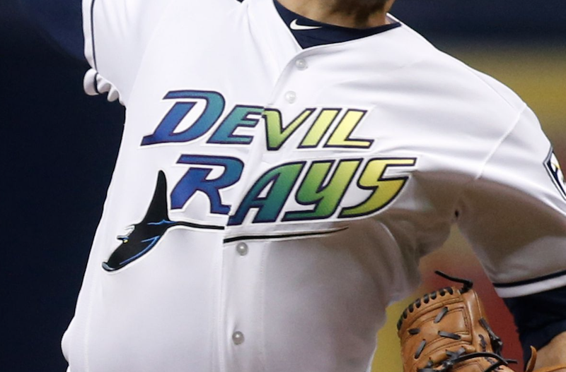
10. 2000 Tampa Bay Devil Rays
This jersey takes me back to playing Triple Play from EA Sports on the Playstation 1. Even though I am a Red Sox fan, every time I played agains the Rays on the game, the jerseys stood out to me. The Durham Bulls, a Triple-A affiliate of the Tampa Bay Rays recently used the 2000 jersey design to sell some Bulls jerseys and hats. I had to pick up the Bulls – Devil Rays themed hat.
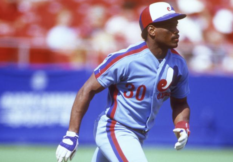
9. 80’s Powder Blue Montreal Expos
This color will be getting a bunch of love for me on this list. The Expos jersey to me harkens back to the days when teams were looking to experiment. Maybe this jersey is a fan favorite since the team is no longer in existence and is now the Washington Nationals, but I feel the bold use of blue with red and white accents helps make this jersey stand out over other uniforms.
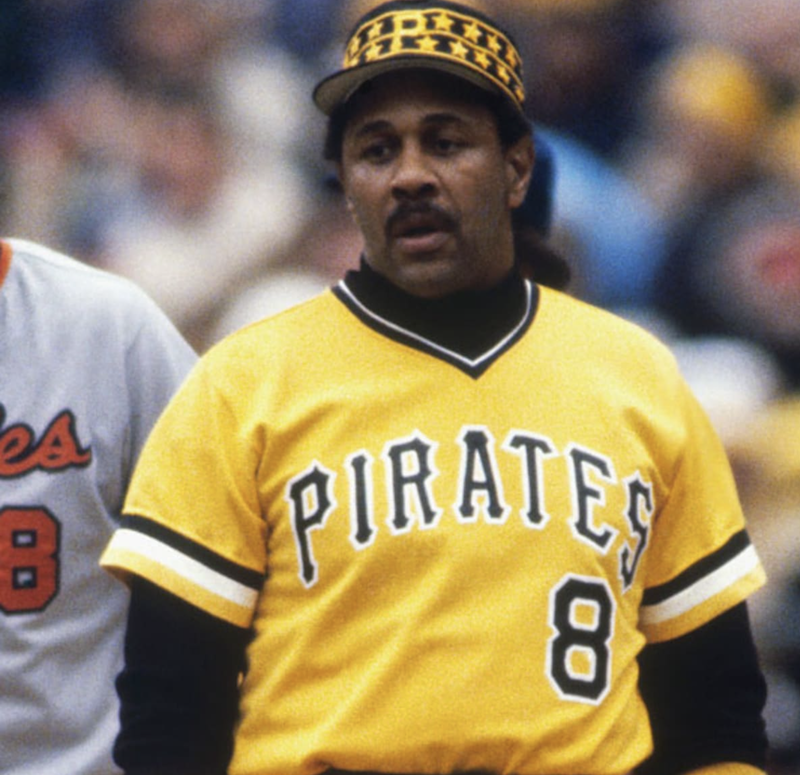
8. 70’s Pittsburgh Pirates
These jerseys are legit. I like the bright yellow with the black and white highlights. The Pirates had a lot of fantastic players rock that jersey back in the day. In addition, I do like the fact that all of three Pittsburgh teams rock the yellow and black colors in unison. I think that is a cool feature for fans of those teams.
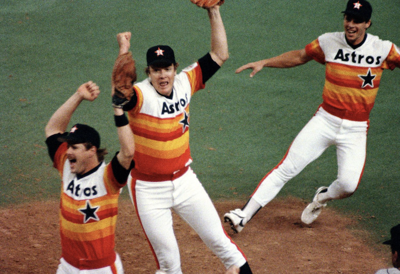
7. 70’s Houston Astros
Lot of rappers in the 90’s and early 2000’s would wear the Houston Astro jersey. It is a very unique jersey that not that many other sports teams even outside of baseball have tried on their uniforms. I feel like the old school Denver Nuggets jersey is on the same level as this jersey. Nolan Ryan’s throwback jersey is the one that most people will purchase.
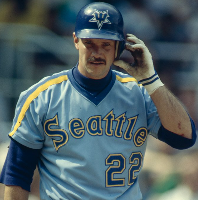
6. Late 70’s Seattle Mariners
The adage that if something isn’t broke, don’t fix it applies to the Mariners and their first uniform. They had a V-neck jersey featuring the trident M and with royal blue and yellow colors. The team’s hat was an M in the shape of an upside-down trident. The owner at the time thought it was bad luck. Not sure about that superstition, but this baby blue jersey is sick.
MLB Uniforms 1-5
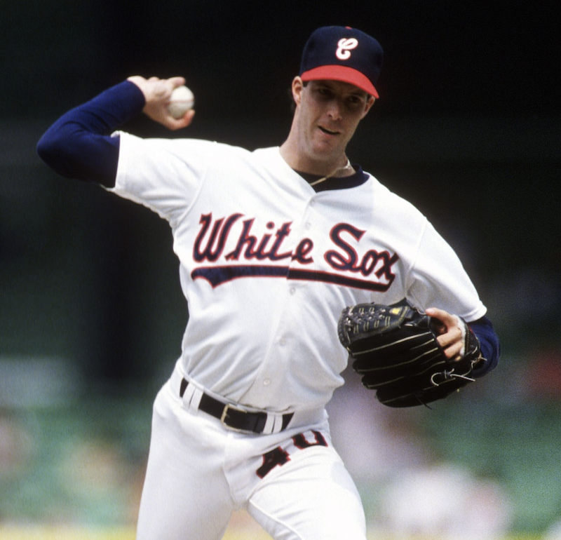
5. 1988 Chicago White Sox
Most people go with the 70’s White Sox jersey with the SOX word written in block style letters when it comes to favorite MLB jerseys, but for me it is their 1988 uniform. These take some inspiration from their 1950s with the red and navy blue colors. Plus I loved the cursive C on their cap mostly because when I lived in a suburb outside of Chicago in the 80’s I was on the White Sox team for my little league team. We got the same hat the pros wore and everyone on our team all loved that fact.
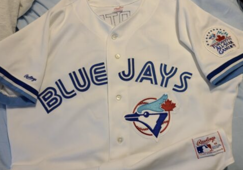
4. 1991 Toronto Blue Jays
The blue and white colors are great together. The font is fresh and something we didn’t really see before. The Blue Jays logo is on point as well. I really like this jersey because even though it has things that are unique, but the style of the uniform is classic. It is the right balance of something new and something true.
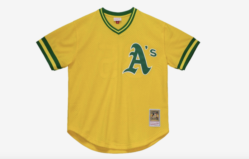
3. 70’s Oakland Athletics
Just like the Pirates yellow jersey, the A’s jersey is a different yellow, but still stands out as an all time classic. Charlie Finley, who ran the team in that era. He wanted the yellow jerseys to pop out on television. He was ahead of his time since now there are about five different jerseys for pro sports teams to sell more merch. The yellow and green are perfect together and are meant to be worn in the summer months.
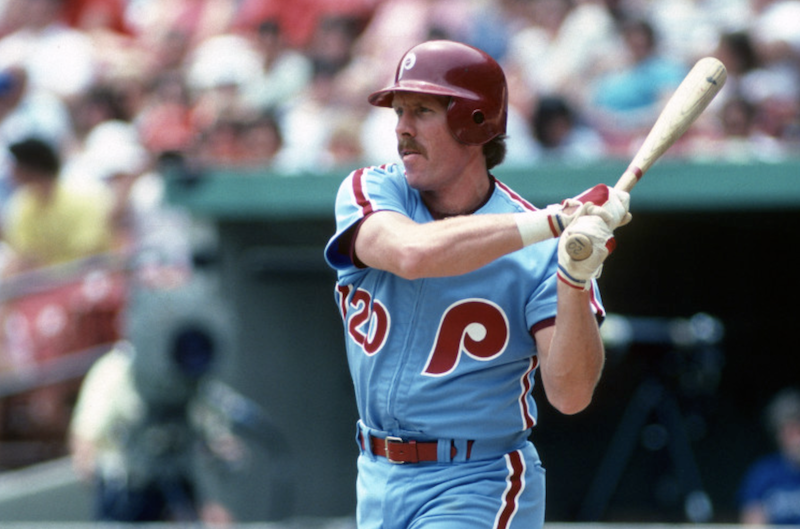
2. 70’s – Early 80’s Philadelphia Phillies
The powered blue color strikes again. This jersey for the Phillies is straight heat. I love the way the maroon lettering and stripes team team up with the blue. These jersey’s stand out and it is one of the all time fan favorites in all of baseball. Mike Schmidt’s jersey is the throwback that many people picked up. Now the team broke this jersey out a few years ago which gained more fanfare with younger fans.
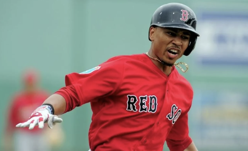
1. Alternate Red Sox Jersey
I know there is some bias since I am a Red Sox fan, but I really love this version of the Red Sox jersey. The red makes the jersey stand out and it combines really well with the navy blue lettering. The traditional jerseys are great, but I appreciate the fact that if a team is called the Red Sox, red should be a predominant color in the uniform. I was really happy to see these jerseys when they debuted.

Best thing about the Phillies powder blues is that they’re zip-up, not buttons.
Hahah. Nice. Thanks for sharing your thoughts.
This is great. I remember being a kid with all of these. And here’s one from the wayback machine – Seattle Pilots. What the hell was that thing over ‘e’? We never knew.
That is too funny! Thanks for sharing David.
I do give 70’s Astro’s # 1. So great
Glad we agreed on the A’s jersey. It is legit.
Art, you homer! Sox red alternate at #1? One word…blah! I’d even take the ’79-’83 grey road unis spelled “BOS TON” over the red alts.
Haha…I really like the red jersey!!!
As a kid I loved the Pirates caps in the 70s/80s. As a Cubs fan I also loved the White Sox uniforms of the late 70s
Great picks, Tom. Love it.
Glad to see powder blues get some respect.
For sure!
There’s no way 70s Astros isn’t always #1!! 😆
Hahah….you can tell I become a homer with the Sox jersey being #1.